Reach us at
solutions@junctiondesign.com
Introduction
Tickld is one of the Web’s most viral and engaging websites. After our collaboration, the website attracted nearly 60 million visitors every month.
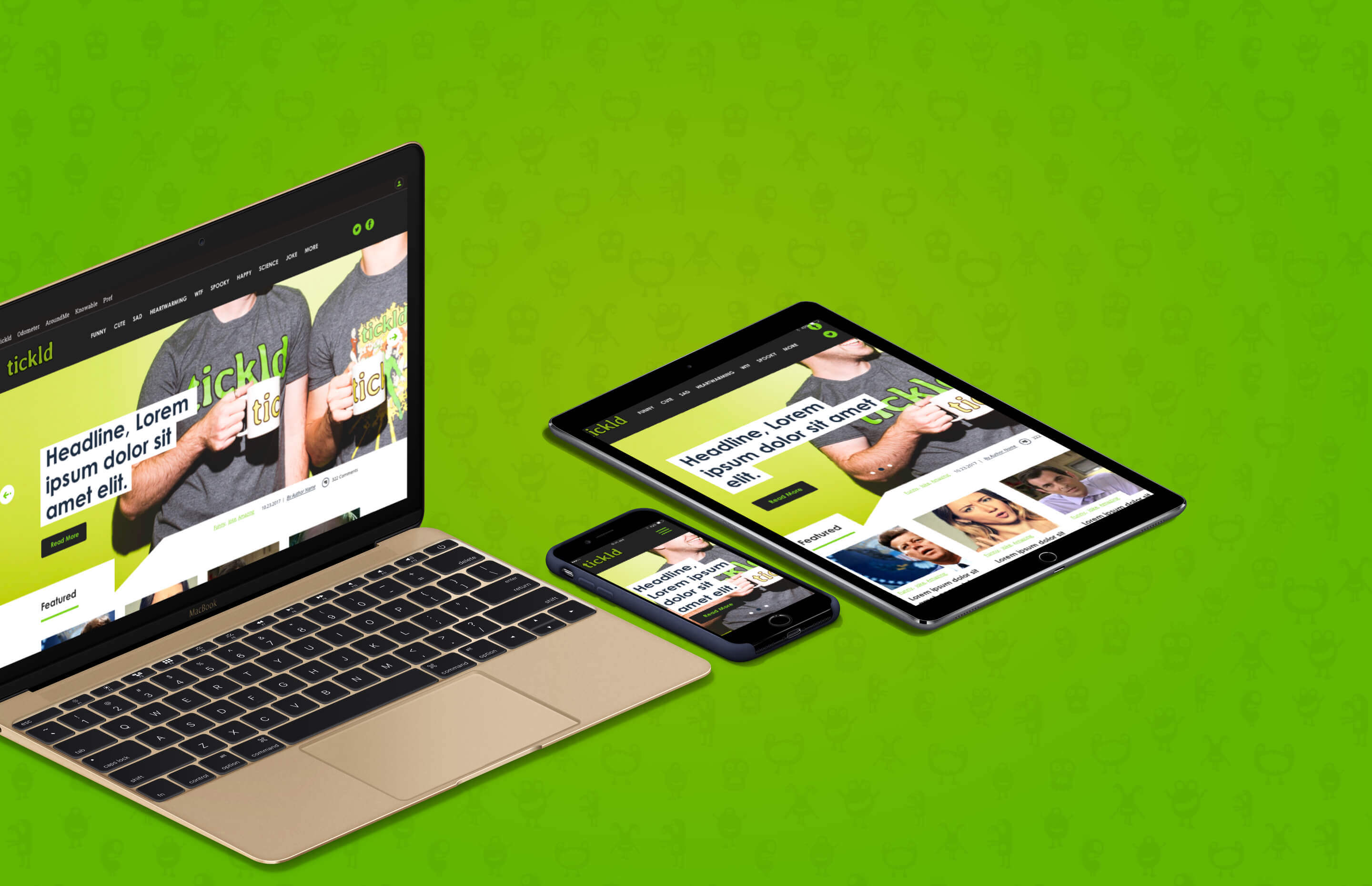
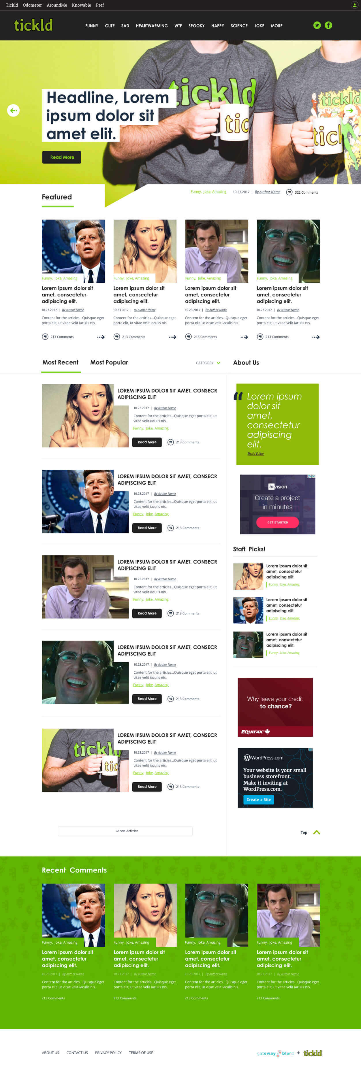
One of our main challenges was to provide a complete responsive overhaul of their interface without alienating their existing users.
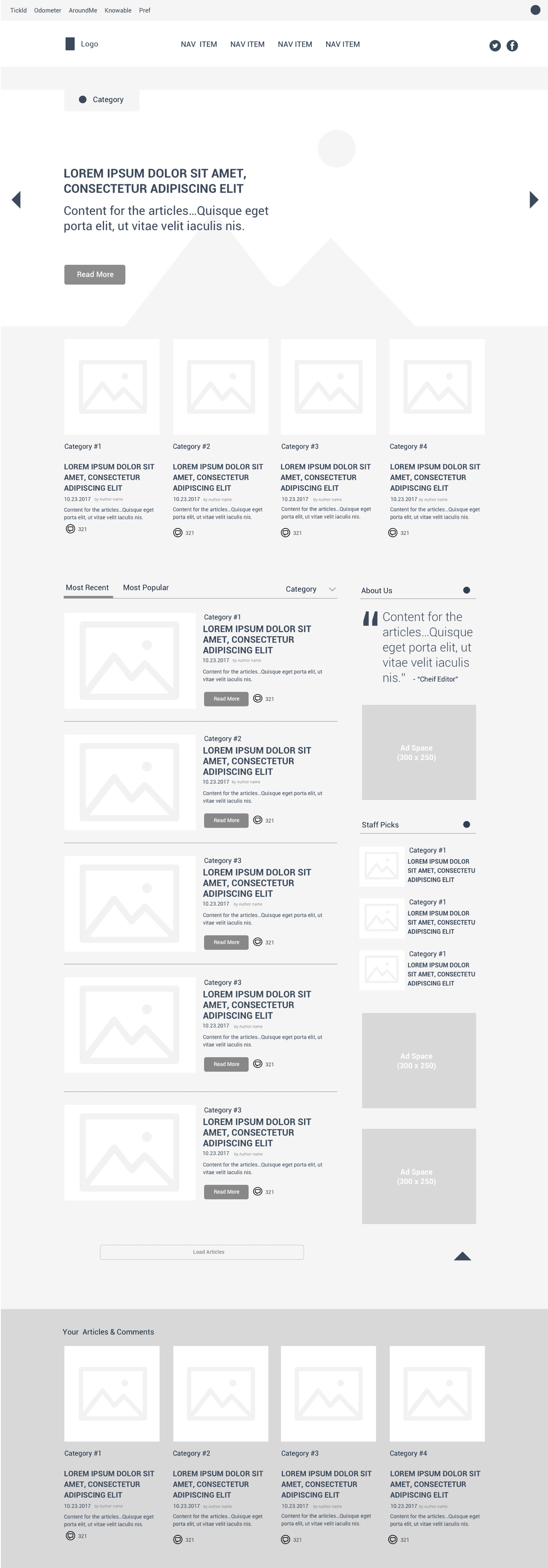
Key considerations
During our initial research, we discovered that Tickld has a strong community. Users are very attached to their current interface, forming a strong emotional connection between it and the site as a whole. In order to minimize impact, Junction team worked with the Tickld team to incrementally release updates and slowly ease users into their updated environment.
From a technical perspective, the Tickld team also needed a way to keep their styles and layout updates in a manageable, expandable format, and easily applicable to multiple sites running on the platform. This solution ended up being a key feature for Tickld’s future growth.
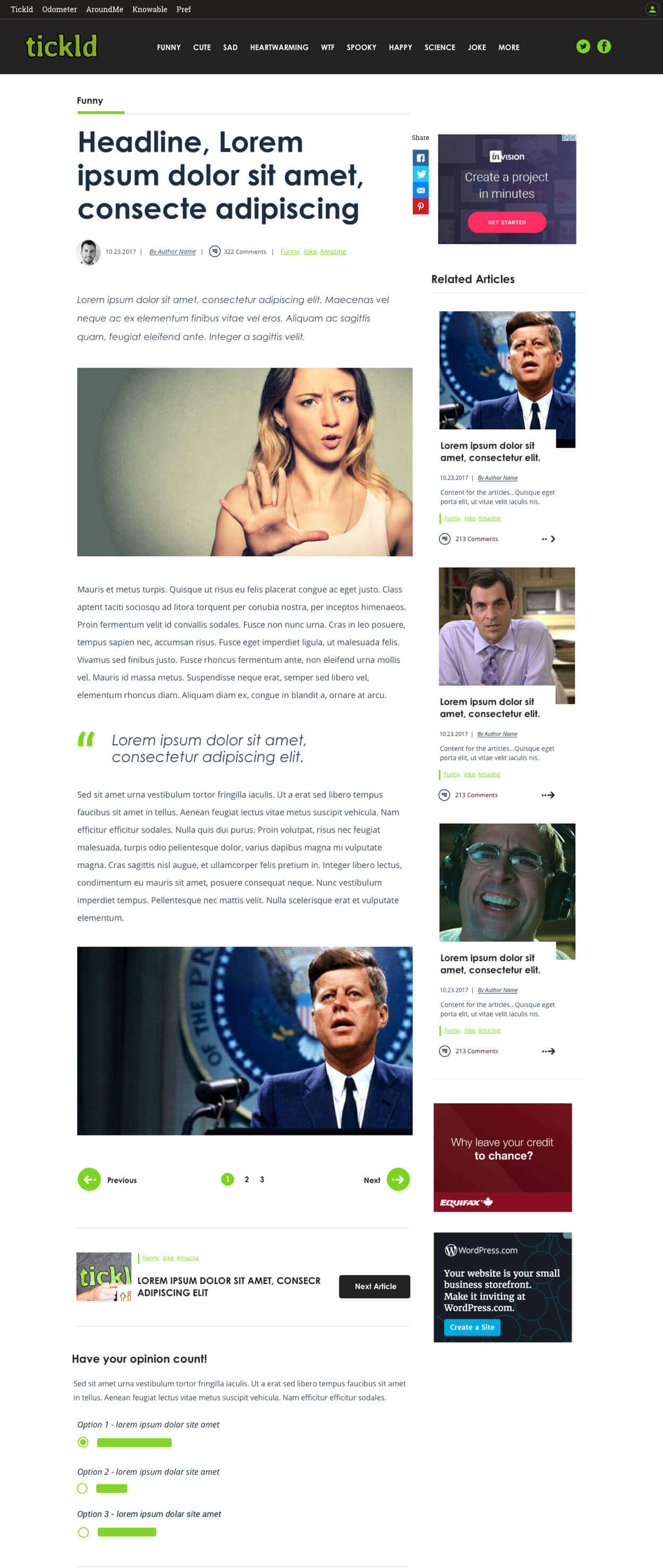
Results
Tickld’s updated user experience maintains the look and feel of Tickld that existing users loved, but added subtle improvements that increase time on page, user engagement, and give the site the modern edge.
Users have welcomed the changes, and the way they have been respectfully implemented to not create any disruption. We look forward to working with Tickld in an on-going capacity to continue making their site one of the best in the world.
Junction Design has maintained a strong on-going relationship with our friends at Tickld, and work with their team to continue adding new improvements. The fantastic results of our initial project have now been applied to emerging areas of the Tickld environment, like their article platform Knowable.
